& SO FORTH
THE HISTORY OF THE AMPERSAND AND THE USE IN FASHION AND MAJOR BRANDS.
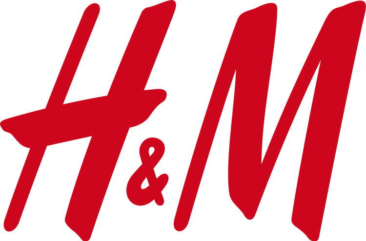
Who doesn’t love the ampersand, that charming, quirky little character separating Crate & Barrel, Ben & Jerry, and H & M? Its pleasing shape lies midway between a letterform and a numeral; it looks like 8’s confused cousin got turned around and grew a tail. In fact, when viewed together with the rest of a character set, the ampersand tends to look like the odd man out. In the very basic Times New Roman, for example, the ampersand is so much heavier and clunkier than the other characters that it feels like a stranger, someone who wandered into the wrong family reunion. Perhaps this is why typeface designers often enjoy drawing ampersands as part of a character set — the usual rules just don’t apply. The ampersand is so stubbornly its own beast that creating a fresh one is an opportunity for some creative crazy time.
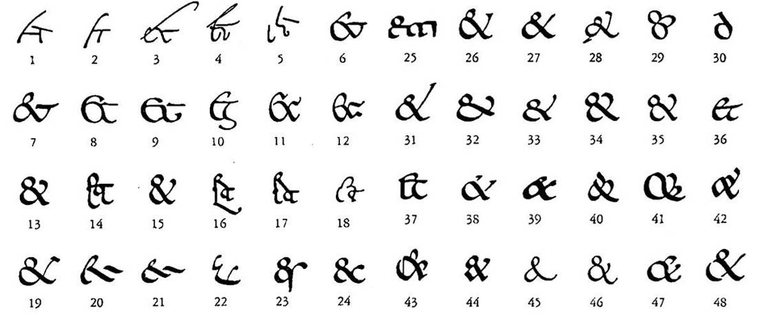
The ampersand made its handwritten debut in the first century AD, first scribbled as graffiti on a Pompeiian wall. Also around this time, Roman orator Cicero’s personal slave and scribe Tiro was hard at work developing a system of shorthand meant for rapid notetaking. Tiro included a symbol in his character set derived from the Latin word “et,” meaning “and;” by the 8th century Tiro’s “et” evolved into a symbol nearly identical to a modern ampersand. Combining the e and the t into a single character or ligature gives us the shape of the ampersand (the two distinct letters are still easily seen merged within a Caslon Italic ampersand).
However, the character didn’t have a name until the early 19th century, when it was still considered the 27th and final letter of the alphabet. For school children reciting their ABCs, it would have been confusing to end up with “X, Y, Z, and.” (And what?) Instead the students said, “and per se and.” “Per se” means “by itself,” meaning the students were saying, “X, Y, Z, and (by itself) and.” Over time, “and per se and” became slurred together into the word we use today: ampersand. (Fun fact: when a new word arises from a mistaken pronunciation, it’s known as a mondegreen.)
No less a typographic authority than Jan Tschichold, author of the formidable 1928 Modernist manifesto Die neue Typographie (The New Typography) has exhaustively documented the history of the ampersand. His 1953 booklet, The ampersand: its origin and development, meticulously traces the character’s history from Pompeii through the 19th century, with thousands of historic examples. Its pages are like a stop-motion animation of the ampersand evolving into its modern form.
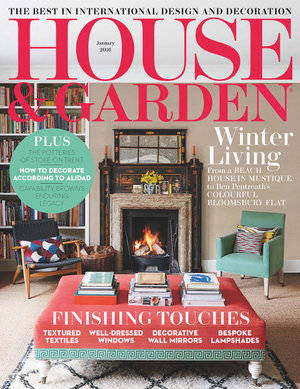
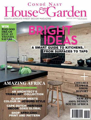
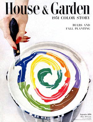
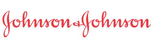
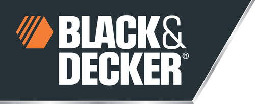
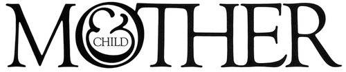
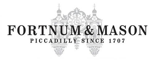
Speaking of which, the ampersand retains its relevancy in contemporary branding. Try to imagine Johnson & Johnson, or Fortnum & Mason without it. Even Black & Decker wouldn’t work as well if it were Black and Decker; the ampersand lends a touch of grace to a severe, masculine logo. Herb Lubalin and Tom Carnase’s iconic nameplate for Mother & Child magazine is perhaps the most illustrative example possible, but many other magazines have made good use of it too. Take a look at House & Garden, which has experimented with different styles over the years for its domestic and international editions, or Town & Country (first published in 1846!) whose design director Edward Leida redesigned its nameplate in 2011. Leida’s redesign scrapped the unappealing upper and lower case type treatment of the 1990’s to return to the more sophisticated uppercase sans serif lettering, similar to what was used in the 1930s, with the words Town and Country interrupted by a very oddly shaped ampersand.
In the fashion world, dozens of companies use the ampersand in their logos: Dolce & Gabbana, H & M, Me & Ro, Line & Dot, Rag & Bone, Cutler & Gross, and Lou & Grey, to name just a few.

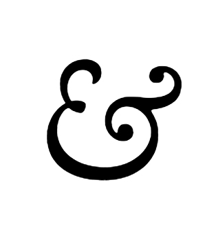
Moshik Nadav, the founder of Moshik Nadav Typography in NYC, is one of many young designers obsessed with creating new ampersands. One of his curvy, sexy, and super-stylish ampersands found its way into the logo of Lou & Grey, an Ann Taylor LOFT lifewear brand launched in 2014. The designer was pleased to see his ampersand take such a defining role in the logo—it’s featured prominently at a huge scale in store signage.
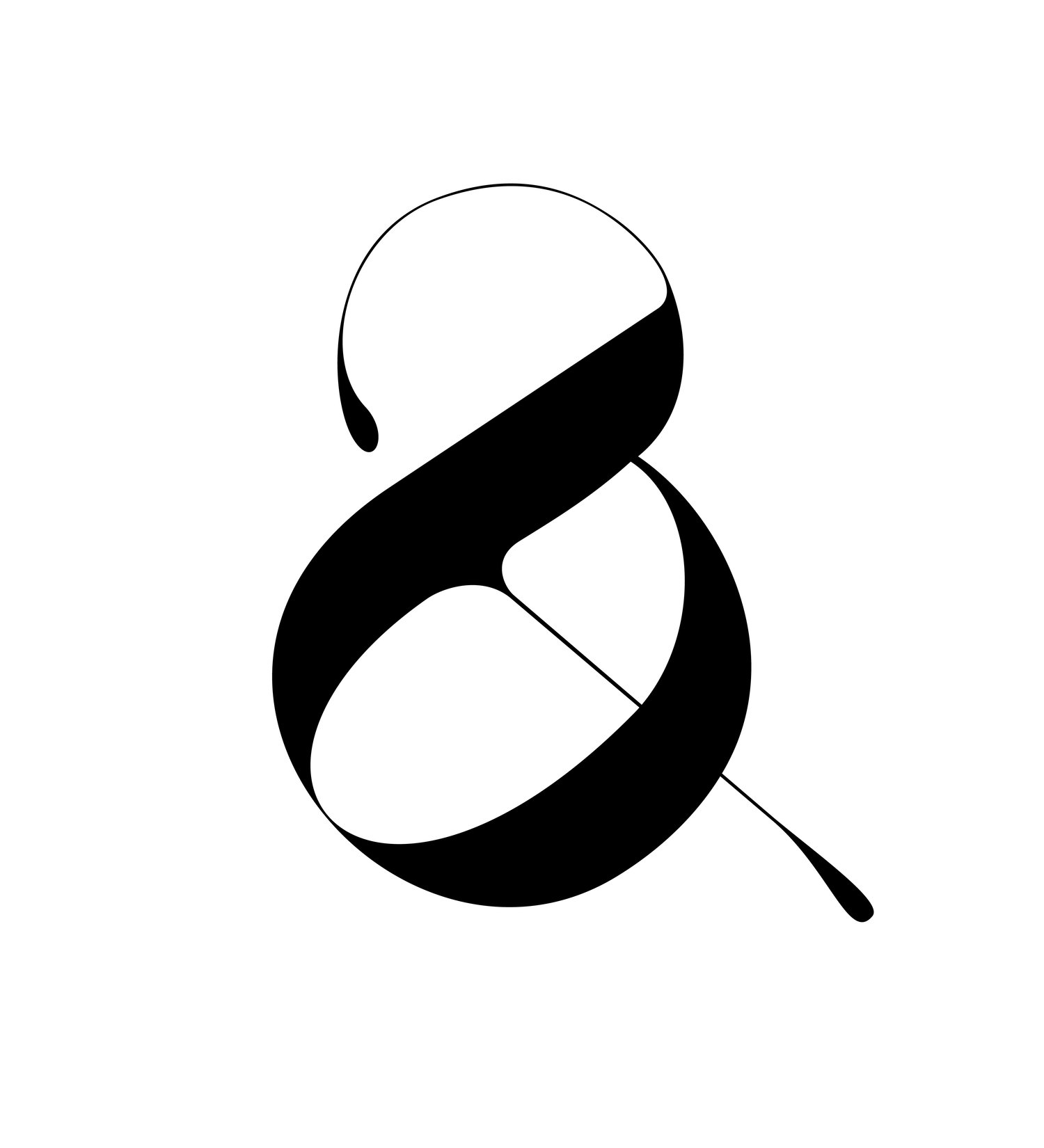
Lou and grey ampersand designed by Moshik Nadav Typography
Nadav says, “The ampersand is such a playful shape. What I like most when I’m designing one is that I don’t have to follow any traditional form for this character; I can be creative and original and re-invent the ampersand.” Nadav embraces the design possibilities of the ampersand with enthusiasm, as his Playful Ampersand collection attests. For this project, he experimented with color, shape, positive and negative space, shading, and dimensionality to create an in-depth meditation on this most curious of characters. Grouped together, the Playful Ampersands form festive bows and snowflakes and patterns that would work perfectly as hip modern wallpaper.
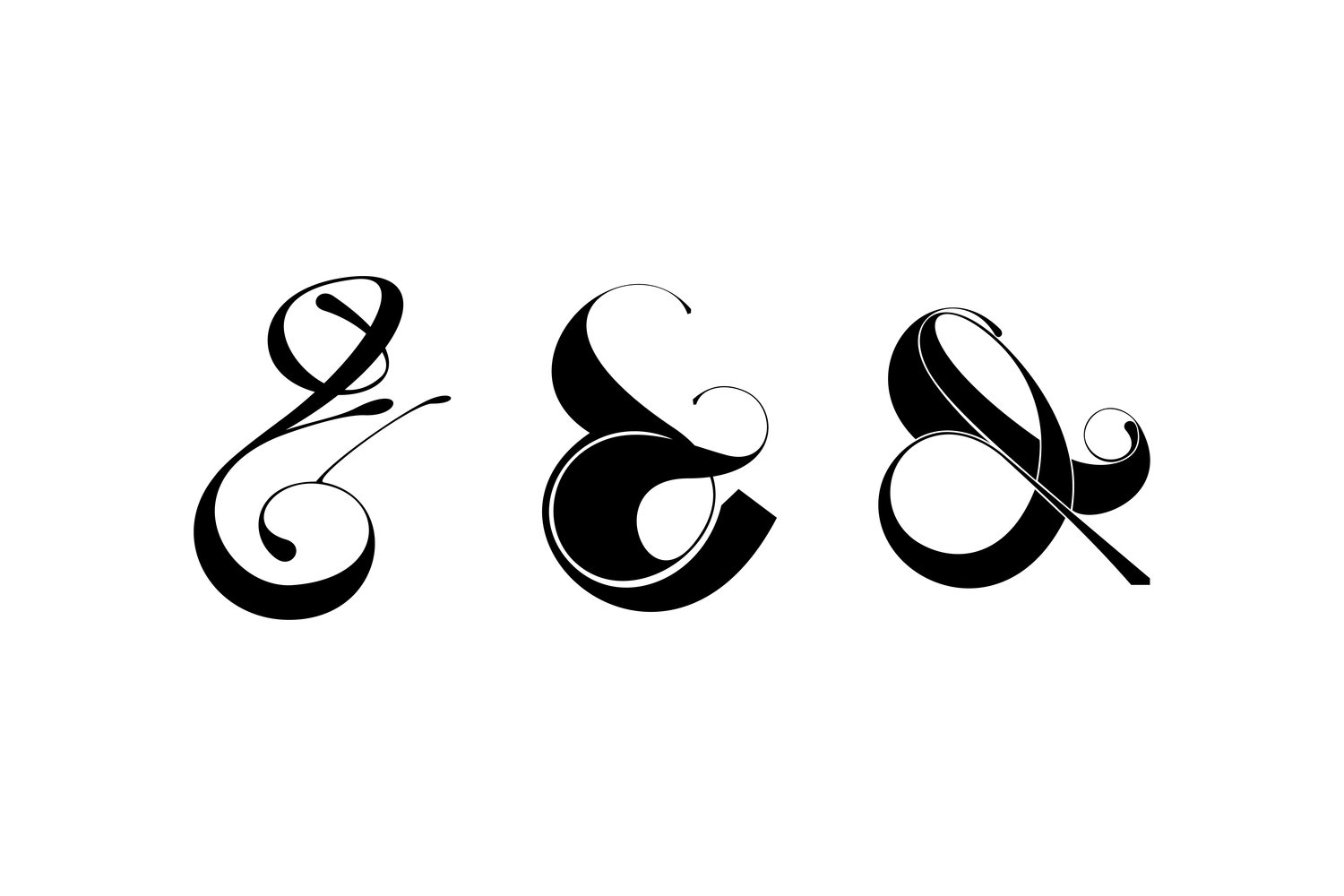
3 Playful ampersands from the experimental project by Moshik Nadav Typography. See more
The ampersand’s eye-pleasing contours also lend themselves well to jewelry. Nadav interpreted two styles of his ampersand, avant-garde or minimal, in sterling silver, 14k gold, or gold plate, as delicate pendants that offer type nerds an elegant way to have their type and wear it too.
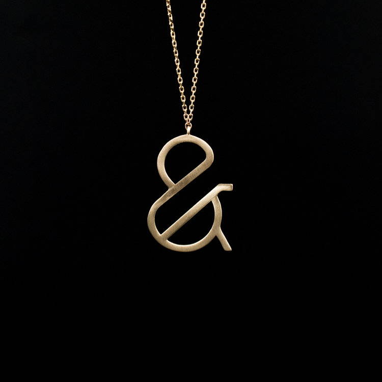
Minimal Gold Ampersand necklace. Designed by Moshik Nadav Typography. Buy here
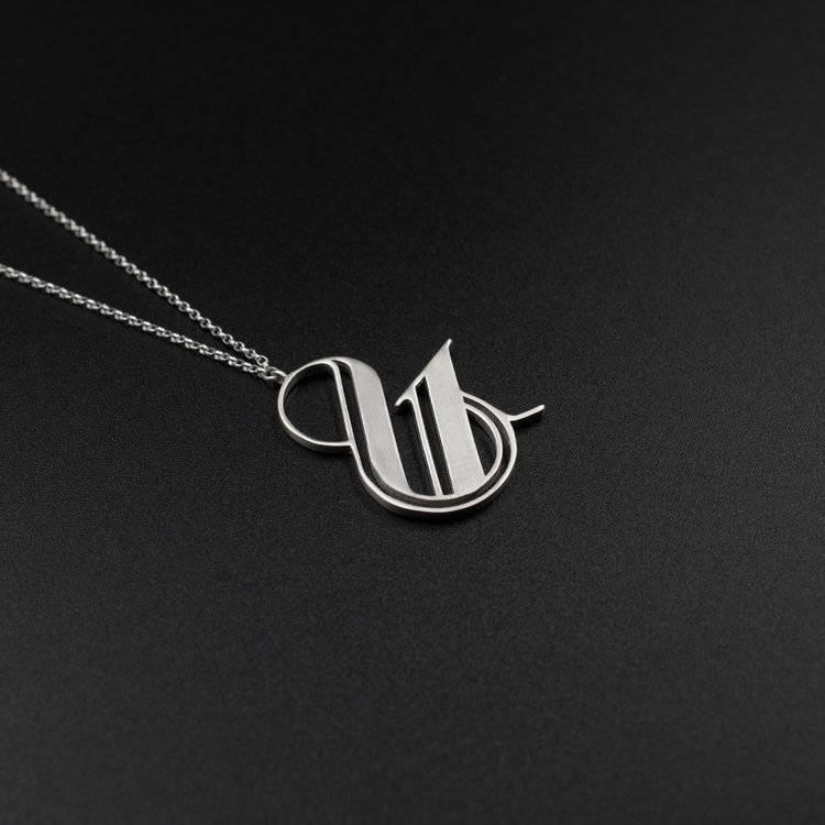
Ampersand logo silver necklace. Designed by Moshik Nadav Typography. Buy here

Ampersand gold necklace designed by Moshik Nadav Fashion Typography. Buy here
The ampersand’s graceful curves paired with its idiosyncratic nature appeal to designers and consumers alike. While designers may appreciate the considerable challenges of drawing good-looking ampersands, consumers see the character as part of a favorite logo, inseparable from the brand itself. From all angles, ampersands add flair and spice to even the most basic design dishes. You wouldn’t season your food with nothing but salt and pepper, would you? Didn’t think so.


& SO FORTH
THE HISTORY OF THE AMPERSAND AND THE USE IN FASHION AND MAJOR BRANDS.

Who doesn’t love the ampersand, that charming, quirky little character separating Crate & Barrel, Ben & Jerry, and H & M? Its pleasing shape lies midway between a letterform and a numeral; it looks like 8’s confused cousin got turned around and grew a tail. In fact, when viewed together with the rest of a character set, the ampersand tends to look like the odd man out. In the very basic Times New Roman, for example, the ampersand is so much heavier and clunkier than the other characters that it feels like a stranger, someone who wandered into the wrong family reunion. Perhaps this is why typeface designers often enjoy drawing ampersands as part of a character set — the usual rules just don’t apply. The ampersand is so stubbornly its own beast that creating a fresh one is an opportunity for some creative crazy time.
The ampersand made its handwritten debut in the first century AD, first scribbled as graffiti on a Pompeiian wall. Also around this time, Roman orator Cicero’s personal slave and scribe Tiro was hard at work developing a system of shorthand meant for rapid notetaking. Tiro included a symbol in his character set derived from the Latin word “et,” meaning “and;” by the 8th century Tiro’s “et” evolved into a symbol nearly identical to a modern ampersand. Combining the e and the t into a single character or ligature gives us the shape of the ampersand (the two distinct letters are still easily seen merged within a Caslon Italic ampersand).

However, the character didn’t have a name until the early 19th century, when it was still considered the 27th and final letter of the alphabet. For school children reciting their ABCs, it would have been confusing to end up with “X, Y, Z, and.” (And what?) Instead the students said, “and per se and.” “Per se” means “by itself,” meaning the students were saying, “X, Y, Z, and (by itself) and.” Over time, “and per se and” became slurred together into the word we use today: ampersand. (Fun fact: when a new word arises from a mistaken pronunciation, it’s known as a mondegreen.)
No less a typographic authority than Jan Tschichold, author of the formidable 1928 Modernist manifesto Die neue Typographie (The New Typography) has exhaustively documented the history of the ampersand. His 1953 booklet, The ampersand: its origin and development, meticulously traces the character’s history from Pompeii through the 19th century, with thousands of historic examples. Its pages are like a stop-motion animation of the ampersand evolving into its modern form.

Speaking of which, the ampersand retains its relevancy in contemporary branding. Try to imagine Johnson & Johnson, or Fortnum & Mason without it. Even Black & Decker wouldn’t work as well if it were Black and Decker; the ampersand lends a touch of grace to a severe, masculine logo. Herb Lubalin and Tom Carnase’s iconic nameplate for Mother & Child magazine is perhaps the most illustrative example possible, but many other magazines have made good use of it too. Take a look at House & Garden, which has experimented with different styles over the years for its domestic and international editions, or Town & Country (first published in 1846!) whose design director Edward Leida redesigned its nameplate in 2011. Leida’s redesign scrapped the unappealing upper and lower case type treatment of the 1990’s to return to the more sophisticated uppercase sans serif lettering, similar to what was used in the 1930s, with the words Town and Country interrupted by a very oddly shaped ampersand.

Moshik Nadav, the founder of Moshik Nadav Typography in NYC, is one of many young designers obsessed with creating new ampersands. One of his curvy, sexy, and super-stylish ampersands found its way into the logo of Lou & Grey, an Ann Taylor LOFT lifewear brand launched in 2014. The designer was pleased to see his ampersand take such a defining role in the logo—it’s featured prominently at a huge scale in store signage.

Lou and grey ampersand designed by Moshik Nadav Typography
Nadav says, “The ampersand is such a playful shape. What I like most when I’m designing one is that I don’t have to follow any traditional form for this character; I can be creative and original and re-invent the ampersand.” Nadav embraces the design possibilities of the ampersand with enthusiasm, as his Playful Ampersand collection attests. For this project, he experimented with color, shape, positive and negative space, shading, and dimensionality to create an in-depth meditation on this most curious of characters. Grouped together, the Playful Ampersands form festive bows and snowflakes and patterns that would work perfectly as hip modern wallpaper.

3 Playful ampersands from the experimental project by Moshik Nadav Typography. See more
The ampersand’s eye-pleasing contours also lend themselves well to jewelry. Nadav interpreted two styles of his ampersand, avant-garde or minimal, in sterling silver, 14k gold, or gold plate, as delicate pendants that offer type nerds an elegant way to have their type and wear it too.

Minimal Gold Ampersand necklace. Designed by Moshik Nadav Typography. Buy here

Ampersand logo silver necklace. Designed by Moshik Nadav Typography. Buy here

ampersand gold necklace designed by Moshik Nadav Fashion Typography. Buy here
The ampersand’s graceful curves paired with its idiosyncratic nature appeal to designers and consumers alike. While designers may appreciate the considerable challenges of drawing good-looking ampersands, consumers see the character as part of a favorite logo, inseparable from the brand itself. From all angles, ampersands add flair and spice to even the most basic design dishes. You wouldn’t season your food with nothing but salt and pepper, would you? Didn’t think so.
BUY THE BEST FONTS FOR FASHION MAGAZINES
ENJOY CUTTING-EDGE FONTS DESIGNED PRIMARILY FOR FASHION MAGAZINES, LUXURY LOGOS, AND HIGH-END BRANDS
PLAYFUL TYPEFACE
FOR PROFESSIONALS
DESIGNED FOR FASHION.
MADE TO SEDUCE.
PLAYFUL TYPEFACE
FOR PROFESSIONALS
DESIGNED FOR FASHION.
MADE TO SEDUCE.
DESIGNED FOR FASHION.
MADE TO SEDUCE.
DESIGNED FOR FASHION.
MADE TO SEDUCE.
THE ULTIMATE TYPEFACE FOR
FASHION & LUXURY
DESIGNED FOR FASHION.
MADE TO SEDUCE.
