ENJOY CUTTING-EDGE FONTS DESIGNED PRIMARILY FOR FASHION MAGAZINES, LUXURY LOGOS, AND HIGH-END BRANDS
DESIGNED FOR FASHION.
MADE TO SEDUCE.
THE SEXIEST.
MOST POWERFUL
TYPEFACE YET.
THE SEXIEST.
MOST POWERFUL TYPEFACE YET.
THE SEXIEST.
MOST POWERFUL TYPEFACE YET.
THE SEXIEST.
MOST POWERFUL
TYPEFACE YET.
DESIGNED FOR FASHION.
MADE TO SEDUCE.
DESIGNED FOR FASHION.
MADE TO SEDUCE.
BUY THE BEST FONTS FOR FASHION MAGAZINES
ENJOY CUTTING-EDGE FONTS DESIGNED PRIMARILY FOR FASHION MAGAZINES, LUXURY LOGOS, AND HIGH-END BRANDS
PLAYFUL TYPEFACE
FOR PROFESSIONALS
DESIGNED FOR FASHION.
MADE TO SEDUCE.
PLAYFUL TYPEFACE
FOR PROFESSIONALS
DESIGNED FOR FASHION.
MADE TO SEDUCE.
DESIGNED FOR FASHION.
MADE TO SEDUCE.
DESIGNED FOR FASHION.
MADE TO SEDUCE.
THE ULTIMATE TYPEFACE FOR
FASHION & LUXURY
DESIGNED FOR FASHION.
MADE TO SEDUCE.
100 YEARS OF VOGUE LOGOS: FROM WHIMSICAL ILLUSTRATIONS TO CHIC DIDONE FONTS
In the early years of the 20th century, magazine covers featured very little typography. A title’s logo or nameplate was not confined to a single typeface (or even a consistent size and placement on the cover), and cover lines were practically nonexistent. Over time the Modern class of typefaces such as Bodoni and Didot with their high contrast between thick and thin strokes came to define typography meant to pair with high-fashion content. Didot, named for the brothers Pierre and Firmin Didot (highly regarded printers, publishers, typeface designers, inventors and intellectuals working during the 18th and 19th centuries), settled onto the cover of Vogue as a permanent part of the landscape in 1955. The delicacy of the hairline strokes ensures that Didone typefaces settle gently over photographs, like thin chiffon veils, while the bolder strokes keep the text legible without ever appearing heavy (heavy type for fashion content is a near-universally shunned design approach).
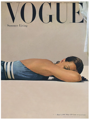
Of all the American fashion magazines, Vogue has come to represent the definitive guide to cutting edge fashion and culture. During current editor in chief Anna Wintour’s nearly three-decade reign, many of today’s young designers, such as Proenza Schouler (Jack McCollough and Lazaro Hernandez) got their start by catching Wintour’s eye and having their collections selected to appear in Vogue’s glossy pages. Wintour doesn’t believe in listening to focus groups or mass opinion; she is a decisive tastemaker with an unerring instinct for identifying the most exciting trends just as they start to happen. A case study of Vogue covers, from its first issue up to the one on newsstands now, provides an illuminating look at the timeline of its logo’s typographic evolution, from last century’s whimsical handlettering to today’s formal Didot nameplate. Current covers also make use of a custom sans-serif font called Vogue AG, created by Terminal Design for Vogue in 2004, which mixes elements of Futura and Avant Garde Gothic.
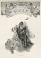
Vogue’s early covers took a lighthearted approach to type. The title launched in 1892 as a weekly for high society New Yorkers, both male and female. According to founding publisher Arthur Baldwin Turnure, Vogue was meant to appeal to “the sage as well as the debutante, men of affairs as well as the belle.” Each issue featured a handlettered logo created by the illustrator hired to do the feature drawing, allowing him to merge it perfectly with the cover’s style and feeling and become an integrated part of the composition. Demurely lovely young women in the style of illustrator Charles Dana Gibson—“Gibson Girls”—occupied these covers along with renditions of the Vogue logo in charming, often intricate scripts.
By 1909, Condé Nast purchased the title with the aim of trying to reach a wider upscale audience, and the cover art became more colorful, theatrical, and abstract. First class illustrators created poster-like images for the covers, working in the Art Deco and Jazz Age styles popular at the time.
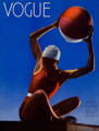
Hand drawn logos remained in the picture throughout the 20’s and 30’s. 1932 saw Vogue’s first color photographic cover, shot by Edward Steichen, with a logo rendered in a minimal set of thin white letters carefully positioned in the upper left hand corner of the magazine, tending towards a more graphic. A 1933 issue with a gracefully scrawled version of the logo shows that handwriting is still very much in the picture, and the logo is still something the designer has latitude to play with. Even as Vogue transitioned into an era where photography was king, its photographers and designers created ambitiously varied and inventive approaches to the logo that integrated letterforms as part of a total approach to design and type choices remained extremely varied.
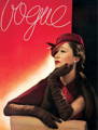
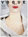
A 1947 edition of Vogue shows an early appearance by the Didot typeface, although in a taller, more condensed version. Vogue still went back and forth with logo typefaces right up until the mid-1950s, jumping from serif to sans-serif and back again, and still mixing in scripts along with illustrative, photographic letters. By 1955, the all uppercase Didot logo settled in to stay; with minor tweaks ever since, it remains a constant presence.
Didot’s crisp letterforms add an imposing typographic formality to Vogue covers, but the magazine occasionally adds another typeface into the mix. Moshik Nadav’s typeface Paris recently starred on the cover of an October 2016 special edition, with a lowercase “g” appearing as part of the term “It Girl.” That single character maintained its alluring personality even in the context of the five formidable letters in the Vogue nameplate directly above it. Paris pushes the contrast of serif and stroke to even greater extremes than the Modern faces. The g wears its ear like a jaunty, rakishly tipped beret while its loop and descender swing flirtatiously beneath the bowl like a playful drop earring. Paris looks just enough like Didot to pair up with it seamlessly, with subtle differences that make it very much its own bit of haute couture.


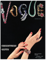
The late 30’s and 1940’s represent a golden era of Modernist fashion magazine design at Condé Nast, with Alexey Brodovitch working magic at Harper’s Bazaar and Mehemed Fehmy Agha and Alexander Lieberman pushing a similar aesthetic at Vogue. The new designs used simplified typography, sans serif typefaces such as Futura, radical placements of headlines and text anywhere on a page, an increased use of photography and white space, and the absence of decorative elements. Vogue covers featured photographs of live models or fabulous jewels arranged into letterforms spelling out its logo, using a basically illustrative approach to typography expressed through the medium of photography.


Buy Paris Typeface here
Buy Paris Typeface here

Buy Lingerie Typeface here
Buy Lingerie Typeface here

Buy Paris Typeface here
Buy Paris Typeface here
100 YEARS OF VOGUE LOGOS: FROM WHIMSICAL ILLUSTRATIONS TO CHIC DIDONE FONTS

In the early years of the 20th century, magazine covers featured very little typography. A title’s logo or nameplate was not confined to a single typeface (or even a consistent size and placement on the cover), and cover lines were practically nonexistent. Over time the Modern class of typefaces such as Bodoni and Didot with their high contrast between thick and thin strokes came to define typography meant to pair with high-fashion content. Didot, named for the brothers Pierre and Firmin Didot (highly regarded printers, publishers, typeface designers, inventors and intellectuals working during the 18th and 19th centuries), settled onto the cover of Vogue as a permanent part of the landscape in 1955. The delicacy of the hairline strokes ensures that Didone typefaces settle gently over photographs, like thin chiffon veils, while the bolder strokes keep the text legible without ever appearing heavy (heavy type for fashion content is a near-universally shunned design approach).
Of all the American fashion magazines, Vogue has come to represent the definitive guide to cutting edge fashion and culture. During current editor in chief Anna Wintour’s nearly three-decade reign, many of today’s young designers, such as Proenza Schouler (Jack McCollough and Lazaro Hernandez) got their start by catching Wintour’s eye and having their collections selected to appear in Vogue’s glossy pages. Wintour doesn’t believe in listening to focus groups or mass opinion; she is a decisive tastemaker with an unerring instinct for identifying the most exciting trends just as they start to happen. A case study of Vogue covers, from its first issue up to the one on newsstands now, provides an illuminating look at the timeline of its logo’s typographic evolution, from last century’s whimsical handlettering to today’s formal Didot nameplate. Current covers also make use of a custom sans-serif font called Vogue AG, created by Terminal Design for Vogue in 2004, which mixes elements of Futura and Avant Garde Gothic.
Vogue’s early covers took a lighthearted approach to type. The title launched in 1892 as a weekly for high society New Yorkers, both male and female. According to founding publisher Arthur Baldwin Turnure, Vogue was meant to appeal to “the sage as well as the debutante, men of affairs as well as the belle.” Each issue featured a handlettered logo created by the illustrator hired to do the feature drawing, allowing him to merge it perfectly with the cover’s style and feeling and become an integrated part of the composition. Demurely lovely young women in the style of illustrator Charles Dana Gibson—“Gibson Girls”—occupied these covers along with renditions of the Vogue logo in charming, often intricate scripts.

By 1909, Condé Nast purchased the title with the aim of trying to reach a wider upscale audience, and the cover art became more colorful, theatrical, and abstract. First class illustrators created poster-like images for the covers, working in the Art Deco and Jazz Age styles popular at the time.
Hand drawn logos remained in the picture throughout the 20’s and 30’s. 1932 saw Vogue’s first color photographic cover, shot by Edward Steichen, with a logo rendered in a minimal set of thin white letters carefully positioned in the upper left hand corner of the magazine, tending towards a more graphic. A 1933 issue with a gracefully scrawled version of the logo shows that handwriting is still very much in the picture, and the logo is still something the designer has latitude to play with. Even as Vogue transitioned into an era where photography was king, its photographers and designers created ambitiously varied and inventive approaches to the logo that integrated letterforms as part of a total approach to design and type choices remained extremely varied.


The late 30’s and 1940’s represent a golden era of Modernist fashion magazine design at Condé Nast, with Alexey Brodovitch working magic at Harper’s Bazaar and Mehemed Fehmy Agha and Alexander Lieberman pushing a similar aesthetic at Vogue. The new designs used simplified typography, sans serif typefaces such as Futura, radical placements of headlines and text anywhere on a page, an increased use of photography and white space, and the absence of decorative elements. Vogue covers featured photographs of live models or fabulous jewels arranged into letterforms spelling out its logo, using a basically illustrative approach to typography expressed through the medium of photography.

A 1947 edition of Vogue shows an early appearance by the Didot typeface, although in a taller, more condensed version. Vogue still went back and forth with logo typefaces right up until the mid-1950s, jumping from serif to sans-serif and back again, and still mixing in scripts along with illustrative, photographic letters. By 1955, the all uppercase Didot logo settled in to stay; with minor tweaks ever since, it remains a constant presence.
Didot’s crisp letterforms add an imposing typographic formality to Vogue covers, but the magazine occasionally adds another typeface into the mix. Moshik Nadav’s typeface Paris recently starred on the cover of an October 2016 special edition, with a lowercase “g” appearing as part of the term “It Girl.” That single character maintained its alluring personality even in the context of the five formidable letters in the Vogue nameplate directly above it. Paris pushes the contrast of serif and stroke to even greater extremes than the Modern faces. The g wears its ear like a jaunty, rakishly tipped beret while its loop and descender swing flirtatiously beneath the bowl like a playful drop earring. Paris looks just enough like Didot to pair up with it seamlessly, with subtle differences that make it very much its own bit of haute couture.

Buy Paris Typeface here

Buy Lingerie Typeface here
BUY THE BEST FONTS FOR FASHION MAGAZINES
ENJOY CUTTING-EDGE FONTS DESIGNED PRIMARILY FOR FASHION MAGAZINES, LUXURY LOGOS, AND HIGH-END BRANDS
PLAYFUL TYPEFACE
FOR PROFESSIONALS
DESIGNED FOR FASHION.
MADE TO SEDUCE.
PLAYFUL TYPEFACE
FOR PROFESSIONALS
DESIGNED FOR FASHION.
MADE TO SEDUCE.
DESIGNED FOR FASHION.
MADE TO SEDUCE.
DESIGNED FOR FASHION.
MADE TO SEDUCE.
THE ULTIMATE TYPEFACE FOR
FASHION & LUXURY
DESIGNED FOR FASHION.
MADE TO SEDUCE.
BUY THE BEST FONTS FOR FASHION MAGAZINES HERE:

The Essential Fonts Package for Fashion Magazines | Buy Now

The Basic Fonts Package for Fashion Magazines | Buy Now
BUY THE BEST FONTS FOR FASHION MAGAZINES
ENJOY CUTTING-EDGE FONTS DESIGNED PRIMARILY FOR FASHION MAGAZINES, LUXURY LOGOS, AND HIGH-END BRANDS
ENJOY CUTTING-EDGE FONTS DESIGNED PRIMARILY FOR FASHION MAGAZINES, LUXURY LOGOS, AND HIGH-END BRANDS
DESIGNED FOR FASHION.
MADE TO SEDUCE.
THE SEXIEST.
MOST POWERFUL
TYPEFACE YET.
THE SEXIEST.
MOST POWERFUL TYPEFACE YET.
THE SEXIEST.
MOST POWERFUL TYPEFACE YET.
THE SEXIEST.
MOST POWERFUL
TYPEFACE YET.
DESIGNED FOR FASHION.
MADE TO SEDUCE.
DESIGNED FOR FASHION.
MADE TO SEDUCE.
THE ULTIMATE TYPEFACE
FOR FASHION & LUXUR
The Essential Fonts Package for Fashion Magazines | Buy Now
The Basic Fonts Package for Fashion Magazines | Buy Now
c
